| Страници во темата: [1 2 3] > | Poll: What makes you choose one font over another? Лице кое објавува дискусија: ProZ.com Staff
|
|---|
This forum topic is for the discussion of the poll question "What makes you choose one font over another?".
This poll was originally submitted by Noni Gilbert. View the poll results »
| | | | Mary Worby 
Обединето Кралство
Local time: 17:43
Член
германски на англиски
+ ...
| Ease of reading | Jun 13, 2013 |
I've entered ease of reading but in reality, I almost never choose a font as I use the font in the original document or the default font in Word. Any font choices are pretty much for personal use only ...
| | | | neilmac
Шпанија
Local time: 18:43
шпански на англиски
+ ...
Sometimes it's simply down to personal preference and on other occasions other factors such as spacing might have an influence, for example I like Tahoma and Calibri, but the former takes up considerably more space (or seems to, I've never actually measured it).
When I was doing pub quizzes, I used Comic Sans Serif for the question/answer sheets and was surprised to find a lot of people actively dislike this font, apparently because it was "invented" by Microsoft. Nowt as queer as f... See more Sometimes it's simply down to personal preference and on other occasions other factors such as spacing might have an influence, for example I like Tahoma and Calibri, but the former takes up considerably more space (or seems to, I've never actually measured it).
When I was doing pub quizzes, I used Comic Sans Serif for the question/answer sheets and was surprised to find a lot of people actively dislike this font, apparently because it was "invented" by Microsoft. Nowt as queer as folk... ▲ Collapse
| | | | | Short memory | Jun 13, 2013 |
I can't even remember lodging this poll! SO much for my memory.
I actively dislike some fonts but I think it's because of overexposure, and my 11 year-old-son is very fussy. But I will be interested to hear other people's reasons for preferences.
Edited to add further comment.
The people around me seem to favour Calibri, now it is standard on Windows. Having to download a font diminishes the likelihood of using it. Those people are either working on screen... See more I can't even remember lodging this poll! SO much for my memory.
I actively dislike some fonts but I think it's because of overexposure, and my 11 year-old-son is very fussy. But I will be interested to hear other people's reasons for preferences.
Edited to add further comment.
The people around me seem to favour Calibri, now it is standard on Windows. Having to download a font diminishes the likelihood of using it. Those people are either working on screen or printing out in Word format, so no great typesetting issues.
Sticking to the client's use seems to be a matter of courtesy amongst other things, although one sometimes wonders over their choice of font.
[Edited at 2013-06-13 09:33 GMT] ▲ Collapse
| | |
|
|
|
Nicole Schnell
Соединети Американски Држави
Local time: 09:43
англиски на германски
+ ...
Во сеќавање на
neilmac wrote:
When I was doing pub quizzes, I used Comic Sans Serif for the question/answer sheets and was surprised to find a lot of people actively dislike this font, apparently because it was "invented" by Microsoft. Nowt as queer as folk...
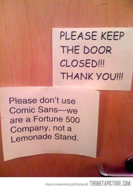

Personally I like Times New Roman and Arial because they easy to read, and I avoid fancy fonts to be compatible with my European clients. Certain source texts however trigger this particular urge to send the translation back in Chinese characters or Gothic Script.
| | | | Odette Jonkers (X)
Холандија
Local time: 18:43
француски на холандски
+ ...
I try to use Times New Roman, especially when I need to print a document; it is said to be the cheapest for printing (less ink). I know, I know, I'm Dutch...
| | | | | Same as source document | Jun 13, 2013 |
When translating, I usually try to use the same font as the source document. The same applies for formatting, as I endeavour to make the translation resemble the original as much as possible. If I have to choose, though, I generally opt for Arial or Times New Roman as they are easy to read and the most commonly used in company style guides etc., as well as being compatible with the Cyrillic alphabet.
| | | | | Unfussy fonts | Jun 13, 2013 |
And enlarged to about 14 or 16pt on screen so that they are very legible with about 40 cm between my nose and the screen.
I don't want to ruin my eyes, at least beyond their very poor present state. 
Small edit
[Edited at 2013-06-13 12:58 GMT]
| | |
|
|
|
For translation purposes, I tend to stick to the client's wishes or I use the original font, if possible.
For personal use, the last time I actually searched for a font I liked was when I was writing my thesis. A few months before sending it off to the printing office, I moved to a different country where panic struck - the font I had chosen was not on my new computer, which meant the whole lay-out was now messed up! Fortunately a friend and former colleague still had access to my o... See more For translation purposes, I tend to stick to the client's wishes or I use the original font, if possible.
For personal use, the last time I actually searched for a font I liked was when I was writing my thesis. A few months before sending it off to the printing office, I moved to a different country where panic struck - the font I had chosen was not on my new computer, which meant the whole lay-out was now messed up! Fortunately a friend and former colleague still had access to my old computer and sent me the font. Panic over, thesis sent off ▲ Collapse
| | | | | Times or Arial | Jun 13, 2013 |
Times New Roman or Arial for me - simply because they are unfussy and easy to read. My current default is Arial 11. And for those nadgery little footers, Arial Narrow in 8 or 9 pitch is a lifesaver!
Steve K.
| | | | | Most of the time adhering to the source | Jun 13, 2013 |
However, my own default font is Verdana 10 and I also like Tahoma and a few others.
Well, yes I like to be creative and like working in InDesign.
| | | | Nicola Wood
Австрија
Local time: 18:43
Член (2010)
германски на англиски
As almost everyone else has said, I stick to the original font whenever possible in translations. For personal use, it often depends on the particular purpose or intended audience, and I tend to go through phases of preferring one font for a while, and then (probably as a result of overuse) finding I really don't like that so much now and changing to another.
| | |
|
|
|
Mario Chavez (X)
Local time: 12:43
англиски на шпански
+ ...
Julian Holmes wrote:
And enlarged to about 14 or 16pt on screen so that they are very legible with about 40 cm between my nose and the screen.
I don't want to ruin my eyes, at least beyond their very poor present state.
Small edit [Edited at 2013-06-13 12:55 GMT]
That's some practical advice right there, Julian.
Even before wearing bifocals, I set my Outlook email fonts to 14 pts for the same reason. All outgoing emails from me have that size.
| | | | | Thanks Mario | Jun 13, 2013 |
Mario Chavez wrote:
Julian Holmes wrote:
And enlarged to about 14 or 16pt on screen so that they are very legible with about 40 cm between my nose and the screen.
I don't want to ruin my eyes, at least beyond their very poor present state.
Small edit [Edited at 2013-06-13 12:55 GMT]
That's some practical advice right there, Julian.
Even before wearing bifocals, I set my Outlook email fonts to 14 pts for the same reason. All outgoing emails from me have that size.
If the specified font for a particular job is Arial Light 8pt, you can bet your bottom dollar that you're going to be ruining your eyes or getting severe eye strain in less than 30 minutes.
You can always change fonts back to the customers' required font, if they have one, at the end of the project after your translation and final proof is finished. No big deal and it saves on frequent visits to the eye doctor. 
| | | | Thayenga
Германија
Local time: 18:43
Член (2009)
англиски на германски
+ ...
| Adhering to the source font | Jun 13, 2013 |
Since I usually translate in a copy of the file, the font in use is the same one as in the original document.
Personally I primarily use Verdana 11 or 12 pt. The second font, used only for special emails or letters, is Monoscript Corsiva 18 pt.
| | | | | Страници во темата: [1 2 3] > | To report site rules violations or get help, contact a site moderator: You can also contact site staff by submitting a support request » Poll: What makes you choose one font over another? | Trados Business Manager Lite | Create customer quotes and invoices from within Trados Studio
Trados Business Manager Lite helps to simplify and speed up some of the daily tasks, such as invoicing and reporting, associated with running your freelance translation business.
More info » |
| | Draftsmith | Edit Translations Faster With Affordable AI You Can Trust
Draftsmith is an affordable AI editing tool for busy translators. It works directly in Microsoft Word, supporting the way you work
ProZ members receive a 20% discount on a single user subscription of Draftsmith.
More info » |
|
| | | | X Sign in to your ProZ.com account... | | | | | |















 Login to reply/comment