Poll: What is your favorite font size when working? Лице кое објавува дискусија: ProZ.com Staff
|
|---|
This forum topic is for the discussion of the poll question "What is your favorite font size when working?".
This poll was originally submitted by Heinrich Pesch. View the poll results »
| | | |
Muriel Vasconcellos (X) 
Соединети Американски Држави
Local time: 06:17
шпански на англиски
+ ...
That's what most of my jobs come in. I never change the source font because I don't want to have to mess with reformatting it. I know that some people do change it. I'd much rather blow it up temporarily.
The problem with smaller fonts is that they are usually reduced to make it possible to squeeze in more text. If I blow it up enough to see it, then the right-hand margin is off-screen so it's hard to read the text.
| | | |
neilmac
Шпанија
Local time: 15:17
шпански на англиски
+ ...
As long as it's legible, I don't really mind. Sometimes I might change the font to one I prefer while working, then change it back into whatever the client wants/expects at the end of the process.
| | | |
| From the valley of the dinosaurs | Jan 22, 2019 |
I favour 11-12 point because I'm one of those dinosaurs who prints out every translation for the final check.
I've tried doing it on-screen but it's not the same. You can't run a finger/pen/ruler down each language to keep your place.
(I know modern CAT tools divide it into easily navigable multi-coloured chunks, but that segmentation is also why I avoid them.)
I'm convinced checking on paper is better for your eyes too, which outweighs any environmental d... See more I favour 11-12 point because I'm one of those dinosaurs who prints out every translation for the final check.
I've tried doing it on-screen but it's not the same. You can't run a finger/pen/ruler down each language to keep your place.
(I know modern CAT tools divide it into easily navigable multi-coloured chunks, but that segmentation is also why I avoid them.)
I'm convinced checking on paper is better for your eyes too, which outweighs any environmental downside. ▲ Collapse
| | |
|
|
|
But it actually depends on the font. For Arial 10 is enough, for Times 12 is the minimum.
| | | |
| Another dinosaur here! | Jan 22, 2019 |
Chris S wrote:
I favour 11-12 point because I'm one of those dinosaurs who prints out every translation for the final check.
Checking on paper also allows you to catch errors you risk missing on screen. I always print mine too.
| | | |
Jan Truper
Германија
Local time: 15:17
англиски на германски
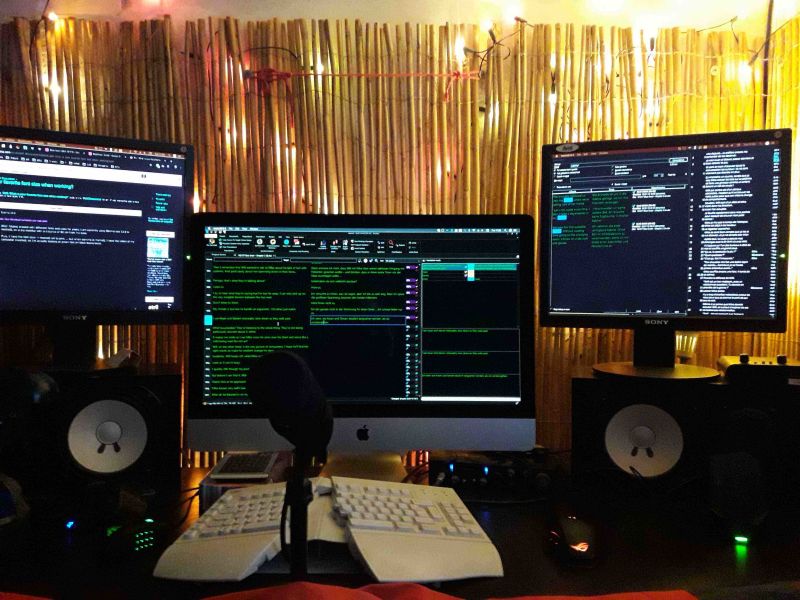
After futzing around with different fonts and sizes for years, I am currently using Ebrima size 13.8 in memoQ, on a sizable monitor with a distance of 80 cm from my eyes.
Plus, I have the font color in memoQ set to pink ... but when working in memoQ, I have the colors of my computer inverted, so I'm actually looking at green font on black background.
| | | |
Thayenga
Германија
Local time: 15:17
Член (2009)
англиски на германски
+ ...
It also depends on the fond, e. g. Monoscript Corsiva requires at least 24pt. I don't change the font size, but simply enlarge the document. Once the translation and proofreading are completed, I restore it to its original fond size.
| | |
|
|
|
Ricki Farn
Германија
Local time: 15:17
англиски на германски
I like zooming in big, because German words love to hide errors at the very end (aka inflections), and the brain reads what it wants to read.
Apparently, I have set my font size in Trados to 16, going by the settings.
| | | |
Rebecca Garber
Local time: 09:17
Член (2005)
германски на англиски
+ ...
| This is why zoom exists on computers | Jan 22, 2019 |
I don't care what size the font is. I change the zoom to suit my mood and energy level.
I deliver in 12 point fonts. But since it's all on a computer screen, the actual size of what I'm reading is moot.
| | | |
Mario Freitas
Бразил
Local time: 10:17
англиски на португалски
+ ...
| Funny questions | Jan 22, 2019 |
Some polls are really funny.
We don't choose the size of the font. We keep the same font as the original document, as well as the formats. We don't change the original formats according to our prefences.
Other than that, we use the zoom, as suggested by other colleagues.
| | | |












 Login to reply/comment
